|
|
||||
|
|
||||
Results of the 2nd World Street Photography competition 5
So many great photos were uploaded in the second WSP5 competition! 1240 to be exact. Congrats to
all who joined the competition!! |
||||
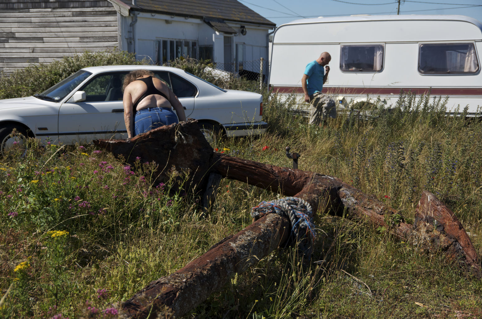
Curators First ChoiceThe curators first choice is awarded to Oliver-Parviz Engel for the image 'anchored' |
||||
Click on the image below and see it full size. |
||||
|
Paulo Abrantes: This picture should come with a warning label, because it messes with your mind without your permission. With this picture I see the world as theatre stage where I am sited in the spectators front row. Something happened before the frame shot, with these two persons, and there is also a feeling that something is going to happen after that frame-time. It just may look as some kind of derivation of a hyper-realistic picture but it´s not. Time, here, is not freezed or stopped in a frame. Some kind of continuous time-line is out-bordering the picture limits to the spectator´s head and continues to flow there and Time itself emerges like a hidden character in a picture, playing a psychological subdued game in the visual reading of the frame. The impact is immediate and the compositional choices of the author are not random but very clear and specific. The chosen vantage point is really so great that one can really feel it is the better way to show this scene with these specific elements; and this particular vantage point is also the guilty part for the viewer to feel like being there, inside, and not in a simple voyeur role but also seeking what´s going on, also participating in the activity on location. But there is more here, in this apple, to slice: this picture is not just a small piece in the continuous time-line of a major play. It´s a piece of pure abstract Time and Space frame, where the author, consciously, is proposing to the viewer to jump in and walk inside the frame and invading this space and crossing this time-line, he can give to those space and time some of his own and personal identity. This is the main power engine of this picture: the personal invitation done to the viewer made, in my opinion, by the chosen vantage point and by the compositional choices and not by a specific element of the composition or body language management of some character in the frame, as usual. Of course there is also some Kinesthetic connection with the viewer and the characters there, but this specific aspect emerges just after the other ones, as simple hints to help the integration of the viewer inside the frame and for him to build his own play role there. One word also for the colour output choice: the false "raw and natural" mood chosen to present the scene fits perfectly and give it some kind of contemporary look, adding also for the written above. The colours are just there to wrap all these aspects in one single package, and no one can really feel lost in a psychological labyrinth of saturated colours without a clue "where to go". A great picture. |
||||
|
||||
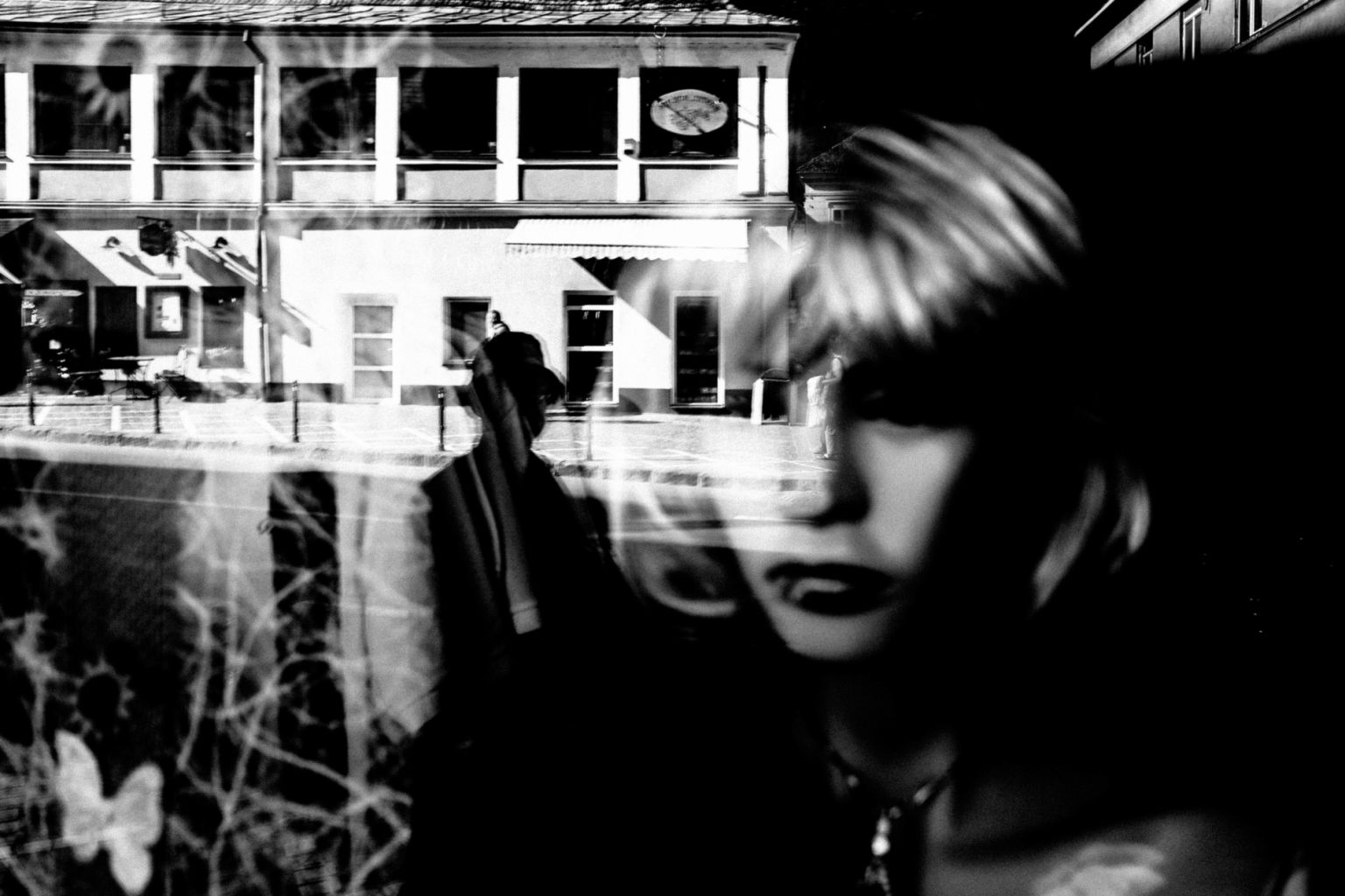
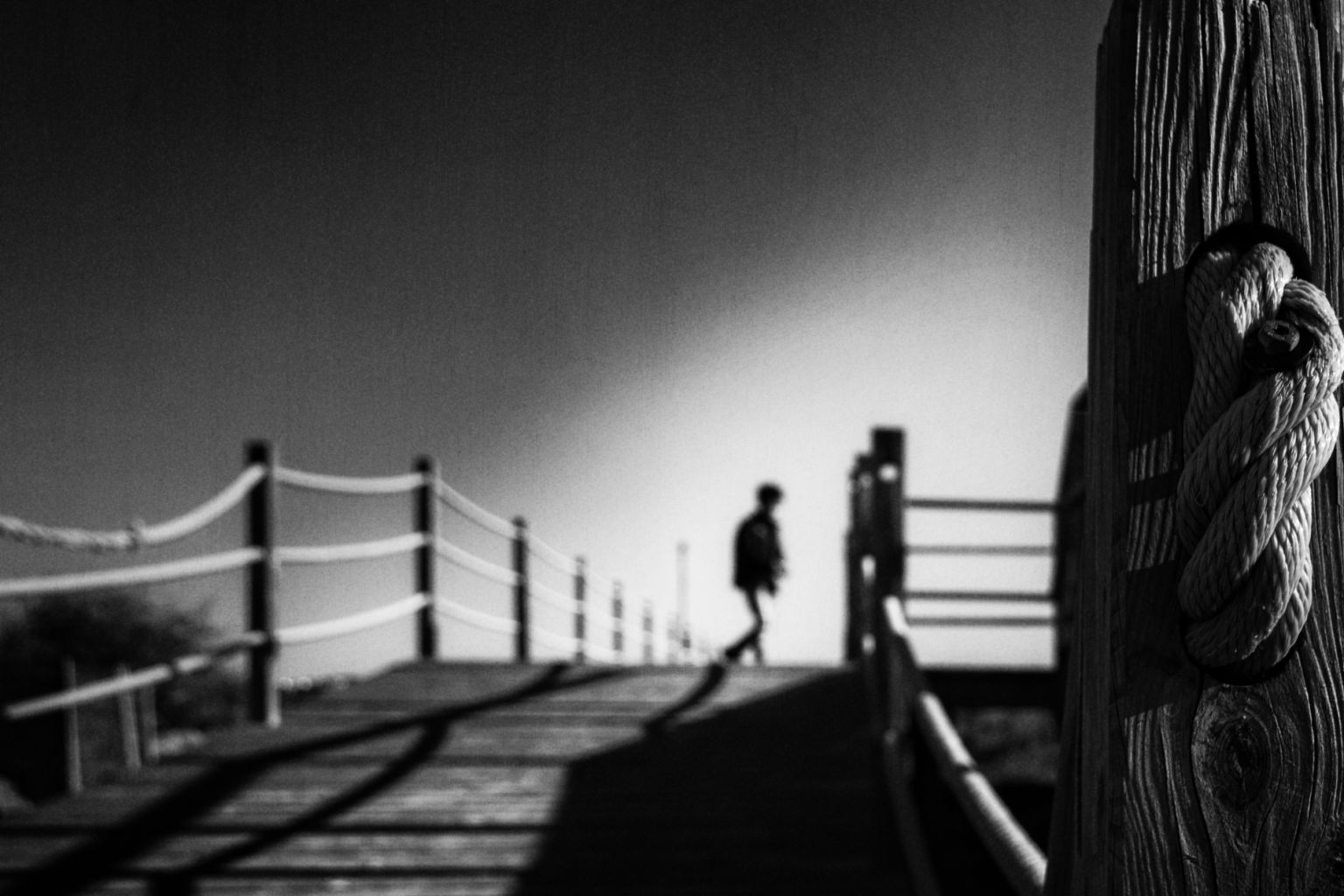 Click on the image below and see it full size. |
||||
|
Paulo Abrantes: In opposition of the classic concept of "freezing" a piece of time in a frame, there are some images where we can see and feel Time flowing and extending or contracting in the frame. It seems to be the case here. There are many ways to use blur in a picture / street picture, for creative purposes. They are almost infinite: speaking in the amount of blur, what elements to blur, how to do it, what kind of blur, depth of field (aperture), blur done with the focus point play, tilt-shift lens blur, motion camera (zooming, panning, spinning) blur and many more blur types. Combined or used in a single way they really can trigger a game change in street photography picture presentation and aesthetics. This is one of these cases: the inner structure of the picture, including the blurred/unfocus zone holds the lines of the composition and the lines of the composition are holding the story. It´s really a coherent composition where the unfocus/blurred elements are not just there as blur with an empty meaning or goal, but they are immediately linked with the perfect focused ones by the viewer, giving a very direct visual reading and allowing an immediate mental connection with the picture. In the other hand the way the elements are organized in the frame are actually leading the viewer to a timeless, continuous and deallocated experience and, as so, putting a foot into an almost pure abstract level, creating a fable and showing how an image can go on and extend itself in time. When this happens in a photograph the author's annihilation within the frame is almost absolute and what we are watching here is some kind of happening or personal experience for the viewer and not just a picture, and I strongly believe this picture rates like this. |
||||
Special mentions |
||||
CARMO by Antonio E. Ojeda |
||||
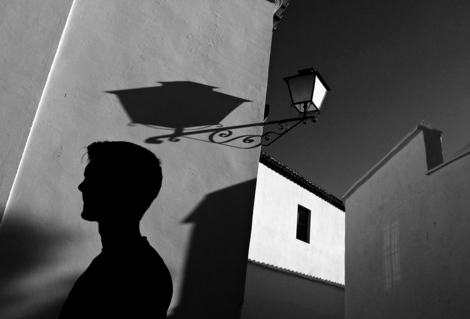 Click on the image below and see it full size. |
||||
|
Paulo Abrantes: What we really see in this picture are subtle connections, dynamic analogies, co-relationships between form, function and content in the geometric composition, all of these presented with some kind of neighborhood intimate delicacy or short space claustrophobia stress, depending the way one feels and projects the mental space of the frame. The so called spot light technique is really a trend nowadays, some authors going less extreme and others going more extreme in the shadow-light play, some authors going for the "fine art" black and white or colour approach and some others staying in some kind of a "straight forward" (whatever this means) presentation approach. The way I see it, what is really difficult in this picture presentation "style" is to take advantage of all the potential of the technique, in a way that the shadow/light play becomes not just a presentation technique for composition elements, using aperture and shutter speed values, but turns itself in some kind of aesthetic mandatory and coherent decision, for what we actually see in the frame. In other words, it really makes sense when, with the shadow/light play, the picture achieves a higher level of mental projection for the viewer, with the shadow/light play becoming itself another inner and major element of a specific composition and not just a "rock, paper, scissors" game done with camera values for street picture presentation. That is the case in this picture. It all comes together, there: the shadow/light play becomes another composition element, a major role one, in a really logic sequence for the viewer, giving a cinematic and motion story telling feeling, with the tiny great detail of the subdued window in the background helping to add some mystery there about what is going on in that place and the highlighted white wall in the background giving some volume and three-dimensional aspect to it – both, the cherry on the top of the cake. In short terms, a great picture done with the most "photography basics". |
||||
Untitled by ayush mishra |
||||
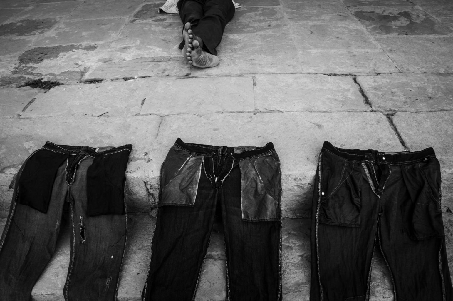 Click on the image below and see it full size. |
||||
|
Paulo Abrantes: Beautiful humanistic picture with some subdued geometrics emerging as an almost abstract composition. A piece of the world history told in a very poetic way. |
||||
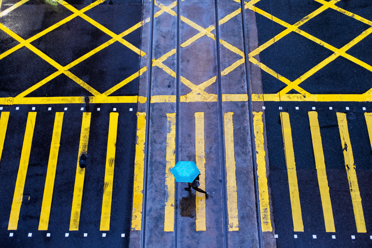
Running in the rain by Wei Wang |
||||
 Click on the image below and see it full size. |
||||
|
Paulo Abrantes: A street geometric composition with a great visual rhythm and colour impact output. The repetition of opposing, crossing and parallel lines gives it some kind of urban maze feel. |
||||
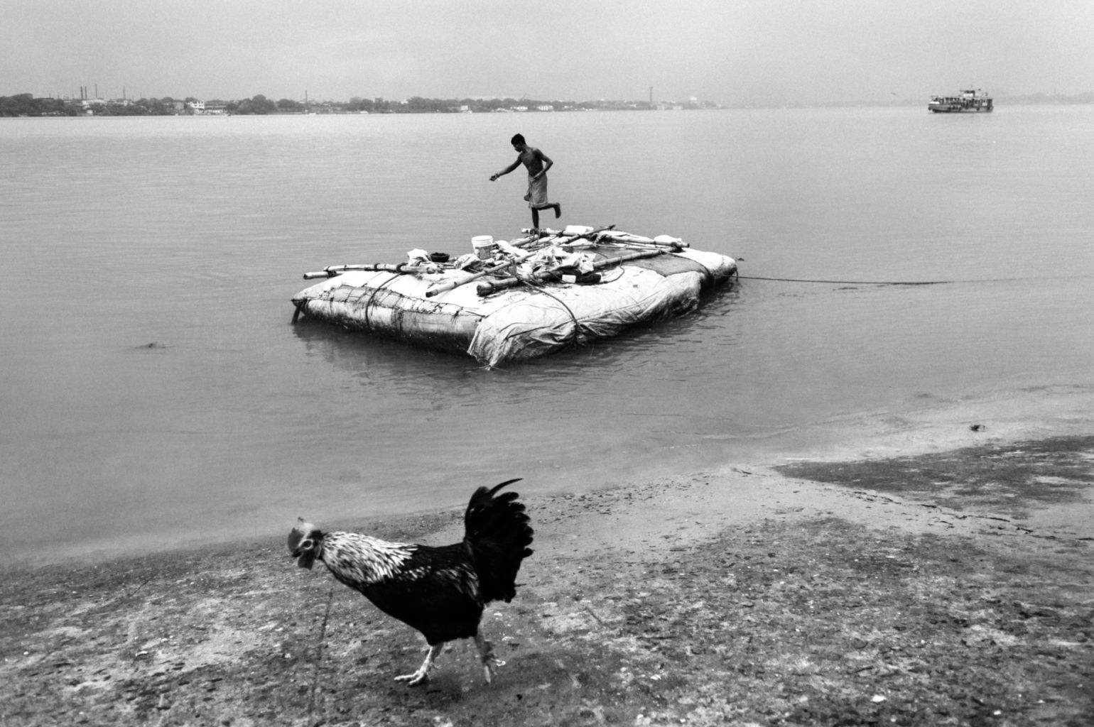
Cock dance by Sutapa Roy |
||||
 Click on the image below and see it full size. |
||||
|
Paulo Abrantes: With a subdued feel of a street-documentary picture and aside from the eerie post-industrial apocalyptic survival mood, what are the odds…? |
||||
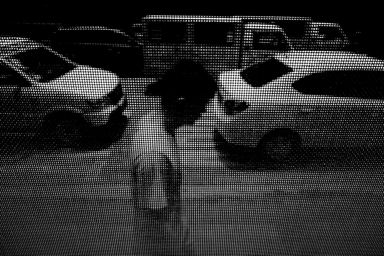
Illusions of reality by Rj Fulache |
||||
 Click on the image below and see it full size. |
||||
|
Paulo Abrantes: Very disturbing picture. Like an halftone print, not showing and just inducing. |
||||
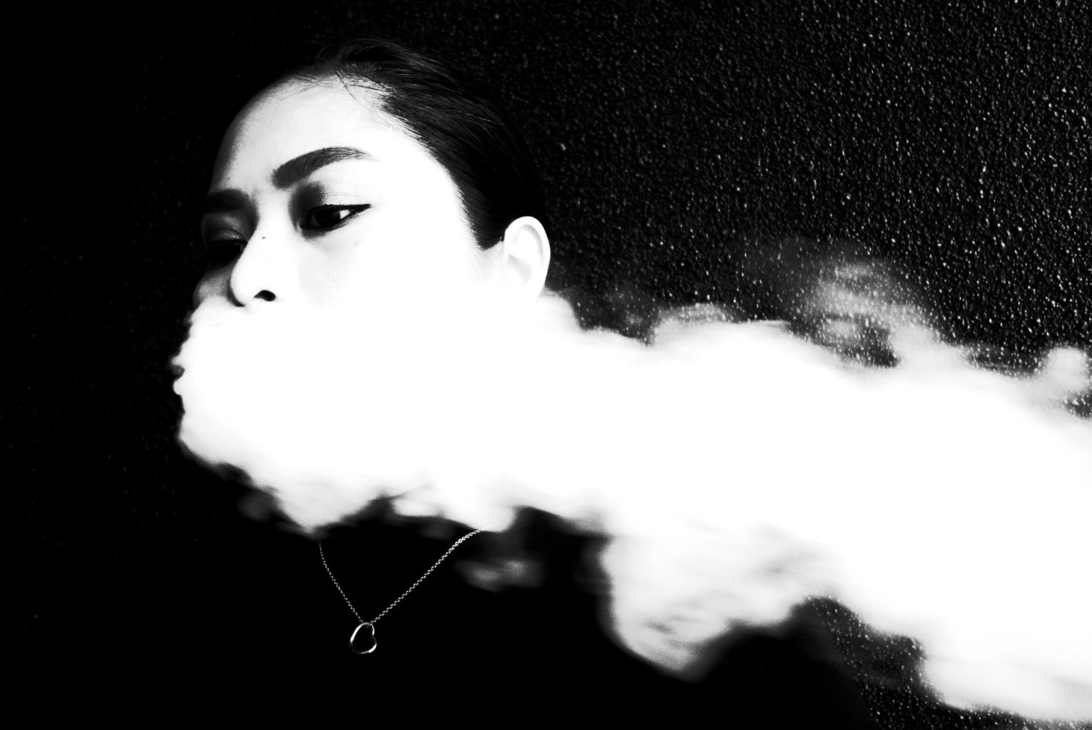
Untitled by Melvin Anore |
||||
 Click on the image below and see it full size. |
||||
|
Paulo Abrantes: Powerful "in your face" street photography. It´s all just about the eye, the scale and the extreme raw bw extraction. |
||||
by Florin Tepardea |
||||
 Click on the image below and see it full size. |
||||
|
Paulo Abrantes: A recurrent theme and style in street photography. This one is very strong in an almost "lyric" way because of the specific composition, communicating immediately with the viewer and nailing his attention. |
||||
Paulo Abrantes Paulo Abrantes is 50, Portuguese, and lives near Aveiro City, Portugal. Mood and geometry are an
integral part of his work. Both help him shape the abstraction in his street images. Paulo believes
that when all the elements come together and the shot works like it should, the image can separate
itself from its location and take on a life of its own.
Paulo Abrantes is 50, Portuguese, and lives near Aveiro City, Portugal. Mood and geometry are an
integral part of his work. Both help him shape the abstraction in his street images. Paulo believes
that when all the elements come together and the shot works like it should, the image can separate
itself from its location and take on a life of its own.This is the main reason Abrantes processes in black & white. His motivation is to present fluid images that might be taken anywhere at any time and he believes black & white works best in achieving these goals. With color images, he feels it is impossible to work freely and yet stay real at the same time. Paulo notes that only black & white allows the possibility to present every frame in such a close, abstract, and personal way. For him, black & white pictures always represent a very personal approach and vision of the world. That is the reason that black & white is his chosen path in photography. Abrantes never uses presets or plug-ins. He always processes in Photoshop in a very basic workflow: curves, levels, exposure, and brightness values in separate layers for what he feels is the maximum personal interpretation of each frame. |
||||
|
||||
 Click on the image below and see it full size. |
||||
|
|
||||
|
Another excellent World Street Photography competition, well done to everyone that entered. Click here and join the new 'Street photography competition' Live competitions ........ Click the links below and join one of our latest competitions. Alex Coghe's street photography competition: Documentary Series competition Chris Suspect's street photography competition: Festivals, Concerts, Parties (2017/2018) Jonathan Higbee's street photography competition: Juxtaposition (2017/2018) Jonathan Higbee's street photography competition: Queer Life Lauren Welles' street photography competition: Emotions (2017/2018) Siegfried Hansen's street photography competition: Urban Geometry (2017/2018) Street Photography (2017/ 2018) - 5 Vinod Babu's street photography competition: Workers |
||||
Peace!Paulo Abrantes & Gido Carper If this email does NOT contain any big photos, please click here to see the full Newsletter (click) If you don't want to recieve this Newsletter any more login and go to: your notifications settings (click) and turn off the newsletter option. |
||||